|
A Higher Resolution print
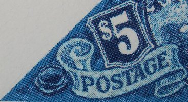
A close up look at various stamps reveals a couple of interesting bits, looking at the bottom left corners of five examples.
Pre-production minisheet.
 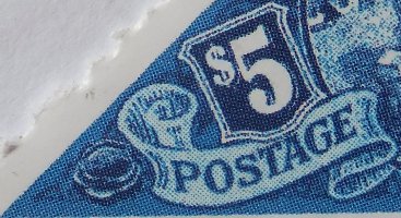
Two examples of Bath perforated
 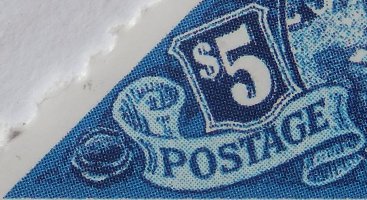
Two examples of Wincanton perforated
The first four close ups are quite comparable, but the second Wincanton stamp seems to have much finer printing. Even more close-up photos of the two Wincantons show the dots are much finer on the second, after adjustments were made to the printing machine to create a higher resolution for the stamps. Stamp papers need more ink on the paper. The problem was that increasing the resolution with a finer pattern of dots resulted in more heat, which could either affect the surface of the paper or activating the gum. The printing machines had to be set up to optimise speed, heat and resolution. Different approaches may have been tried throughout the period, but you can see that one significant change has been tried on some later Brass Bridge stamps.
 
Despite the marked microscopic differences, to my eye there is not much difference manifested in the end result. The background to Postage and Revenue does seem to be slightly more bluer, but only when the two stamps are seen next to each other. It does demonstrate though that different print runs were used at least during the Wincanton perforating period. I would stick my neck out and suggest that the second Wincanton example shown here is a later run. The first matches the earlier Bath examples, and the perforating quality of the second Wincanton stamp is near perfect whilst that on the first is quite rough with a number of blind holes. This could reasonable be due to gaining practice at perforating, and learning how to look after the perforating pins over time.
A Dodgy T
The T in POSTAGE has not printed correctly in two Bath perforated stamps and one of the Wincantons - the earlier one. It is most pronounced in one of the Bath stamps. This may not be a flaw as such, but something introduced as a result of scaling the images to size on the sheets. In contrast, the high-res Wincanton seems to show an improved T. This is probably as a result of the improved printing rather than the T being corrected on the images, vindicating the higher resolution.
   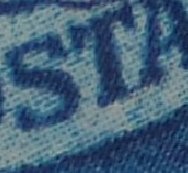
Bath Wincanton
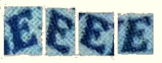
Different Es
There are 4 Es in POSTAGE and REVENUE, but each has different serifs on the right hand side. I think this is a consequence of rotating and stretching parts of each of them to fit the curve of the scroll. I cannot decide whether the letters are positioned one by one during the design stage, or whether the text was added to a pre-defined path along the middle of the scroll. I favour the latter, with the serifs coming about as a result of computer-assisted sizing, fitting and positioning.
|